Introduction to Spectrogram Analysis
We’ve made some major progress towards being able to write a song-recognition app. It took us some time to break down what sound is and how to record it, and, at last, we developed some mathematical “chops” so that we can being to quantify the musical contents of a recording. Indeed, Fourier analysis is our ticket towards distinguishing songs from one another in an systematic way; we need only extend the application of these methods slightly in order to extract “fingerprints” from these songs.
We will be learning about spectrogram analysis, which will allow us to describe what notes are being played in a song as well as when they are being played. To understand our motivation behind this, let’s understand the blind spots in our current tools for quantitatively analyzing audio data.
Listen to the following five second audio clip.
Three notes are played in accumulation, each spaced about a half second apart from one another, until all three are being played together. There is a brief pause right before the three second mark, and then the three-note chord is struck once again and held for the remainder of the song.
Leveraging Our Methods of Audio Analysis
Let’s see if our current means of analysis – plotting the temporal waveform of the recording alongside its Fourier spectrum – can bear this out.
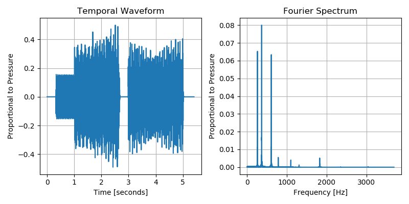
The temporal waveform reveals that the audio clip lasts for about five seconds; it also shows a jump in loudness around the 1 second mark and the brief gap just prior to the three second mark, before the sound resumes. It certainly doesn’t provide us with any interpretable information about what notes are being played, but we already knew that this would be the case – to distill actual notes from this “cacophony of data” was the entire thrust of our introduction to Fourier analysis.
So what does the Fourier spectrum tell us? It reveals the three prominent notes being played: (approximately) \(261\;\mathrm{Hz}\), \(366\;\mathrm{Hz}\), and \(609\;\mathrm{Hz}\) (along with some “overtones”, which will be introduced in a video linked below). Note, however, that it tells us nothing of when these notes were played nor their duration. We also cannot tell from the Fourier spectrum that there was a pause in the music near the three second mark of the recording.
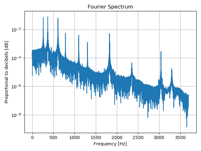
It is also useful to plot the \(y\)-axis of the Fourier spectrum on a logarithmic scale. Recall that humans perceive loudness on a logarithmic scale, which is often measured in decibels. As we will see, a spectrogram will also plot Fourier components on a logarithmic scale. See that the three most prominent notes are still present, but now it is easier to see the quieter overtones that are also present in the recording.
Conveying Time and Frequency: The Spectrogram
Ultimately, we want to marry the temporal information of the waveform with the incisive frequency-decomposition of the Fourier spectrum; this is exactly the purpose of the spectrogram. Depicted below, the spectrogram tells us what notes are being played and when. This visualization is a “heat map” whose colors tell us how prominent or quiet any given note is. The \(x\)-axis is the temporal axis and the \(y\)-axis conveys information of the frequency content of the recording at a given time.
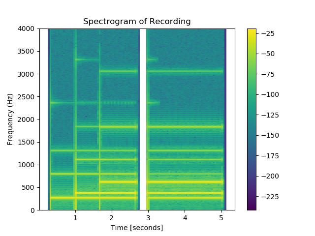
The color map used here indicates the most prominent notes with bright yellow, while near-zero amplitudes are dark green.
The spectrogram displayed above reveals that the \(261\;\mathrm{Hz}\) note was struck first (with overtones near \(700\;\mathrm{Hz}\), \(1,300\;\mathrm{Hz}\), and \(2,400\;\mathrm{Hz}\)). The \(366\;\mathrm{Hz}\) note was struck about a second later, and then the \(609\;\mathrm{Hz}\) sounded near \(1.5\;\mathrm{seconds}\). The gap preceding the three second mark can clearly be seen, followed by the resumed three-note chord. This is a quantitative summary of our audio recording that can be easily aligned with the qualitative experience of listening to the recording.
Simply put: a spectrogram is constructed by breaking the audio recording into brief temporal windows and performing a Fourier transform on the audio samples within each window. A vertical column of pixels in the spectrogram corresponds to a narrow time interval, and the heat map along that column stores the Fourier spectrum of the audio data in that time interval. The tall peaks in the Fourier spectrum for that time interval correspond to bright colors in the heat map along that column, and shallow regions of the Fourier spectrum correspond to dim colors.
The next set of exercises will show us how to leverage matplotlib’s built-in spectrogram to analyze audio recordings. They will also step us through the process of constructing our own spectrogram from scratch.
To conclude, let’s watch a brief video that demonstrates a spectrogram that evolves in real time as sound is being recorded. This will help mature our intuition for what the spectrogram reveals to us about audio recordings. It will also provide some nice insight into the overtones that often appear in these Fourier analyses.
Reading Comprehension: Interpreting the Spectrogram:
Refer back to the Fourier spectrum of the audio recording, which was plotted on a logarithmic scale. Note the locations of the three most prominent peaks, which register above \(10^{-2}\) on the plot, and locate these three notes on the spectrogram along with where they manifest on the \(x\)-axis. Listen again to the recording and correspond what you hear with the emergence of these notes in the spectrogram.
Next, count the number of prominent peaks on the Fourier spectrum (plotted on the logarithmic scale). Can you find a one-to-one correspondence with these peaks and the distinct notes and overtones present in the spectrogram?
Reading Comprehension Exercise Solutions
Interpreting the Spectrogram: Solution
Refer back to the Fourier spectrum of the audio recording, which was plotted on a logarithmic scale. Note the locations of the three most prominent peaks, which register above \(10^{-2}\) on the plot, and locate these three notes on the spectrogram along with where they manifest on the x-axis. Listen again to the recording and correspond what you hear with the emergence of these notes in the spectrogram.
Next, count the number of prominent peaks on the Fourier spectrum (plotted on the logarithmic scale). Can you find a one-to-one correspondence with these peaks and the distinct notes and overtones present in the spectrogram?
There are 10 distinct peaks in the log-scaled Fourier spectrum – 3 notes and 7 overtones. All ten of these features manifest as distinctive horizontal lines on the spectrogram, residing at the same frequencies, which are plotted along the \(y\)-axis on the spectrogram and the \(x\)-axis of the Fourier spectrum.